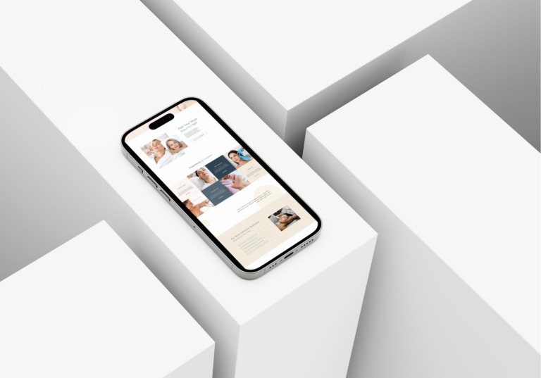

They’d had clinic websites built elsewhere by professional designers, and they felt upset by the results. They had been left with a final product that they would need to invest more in to fix. Some of these websites were carelessly built, featuring broken links, a lack of UX, and an inconsistent visual identity. But the main issue throughout was that they had been built by someone who didn’t understand the industry they were designing for, or how to connect with the patients landing on them.
After being on a call with one of these clinic owners, who had such a unique position and point of view, I read her website and didn’t even recognise her.
And that right there is a messaging problem. The patient journey she’s created, her point of view, her approach, the thing that would make the right patient stop scrolling and think, “this is exactly who I want”, but none of it was on her website. In a £3.6 billion industry that’s growing rapidly, being able to instantly connect with a potential patient who lands on your website is key.
Let’s Explore How These Clinics Chose a Website Designer
The narrative that kept echoing through was they chose the designer because “they’d built previous aesthetic clinic websites”, and I get it. It’s a natural trust indicator. Previous experience should mean they’re all good for the project, it makes sense, of course!
The thing about websites is that they’re not just a pretty business card or something pleasing to the eye that will bring you more clients due to stunning design alone. And that’s exactly the problem. Because pretty is easy to sell in a portfolio. Effectiveness is harder to demonstrate until someone is actually sitting in front of your website trying to navigate, looking for a reason to book.
And this is where messaging and, in this particular instance, patient perspective come in. Because if all your designer has focused on is, well, the design, then your website has no way of landing with the right patient and making them feel like you’re the one before they’ve even met you.
Maybe you’re thinking, “Well, what do you mean ‘the right patient’? I just want to be fully booked.” But let’s look at it this way: who don’t you want in your chair? Think about the last time you felt like your time was wasted, and how often this happens. Perhaps it’s by bargain hunters, or those expecting overnight miracles from one treatment. Whatever your answer may be, there are certain patients you’d rather avoid, and that’s why it’s important that your message lands with the right patient.
Ultimately, Your Designer Needs to Be Able to Make Sure Your Website Speaks Directly to Your Ideal Patient
A patient should land on your website and feel like you’re speaking directly to them. This is not clinic-to-clinic communication. It’s a brand speaking directly to the person they want to help, so an understanding of the industry and the patient’s perspective is just as important as the design skills themselves.
Understanding is not just knowing what kinds of treatments you offer, how to put them into a mega menu, or how to integrate a booking system. That’s how these websites end up looking like a carbon copy of each other. Nothing stands out. There’s no unique selling position and it could belong to any clinic. There’s no reason for the right patient to stop their search, trust, or book.
The best thing a designer can have? An approach that treats messaging, UX, and design as a whole, not three separate deliverables. Because the moment copywriting becomes an afterthought, written as filler to add in at the end, the design ends up built around nothing.

So How Does This Work in Practice?
Messaging is the backbone of a website that actually works. And when we say messaging, we mean everything that communicates who you are, what you stand for, who you’re for, and why the right patient should choose you over everyone else. Your point of view. Your unique position. The language that makes your ideal patient feel like you’re speaking directly to them. That’s what sits at the core of every page, heading and line of copy.
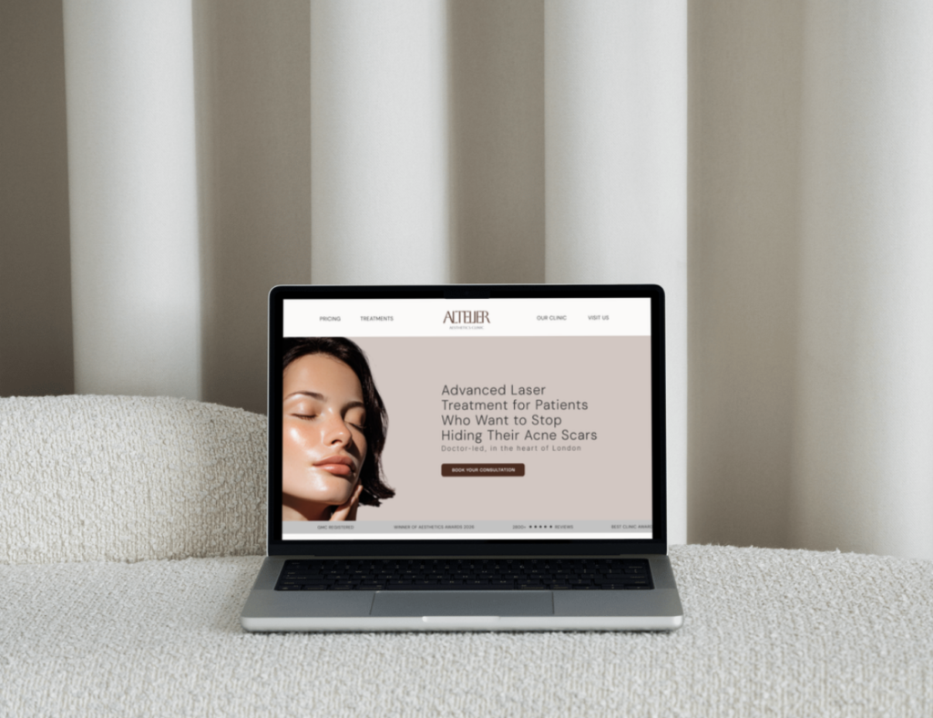
Think about a homepage that opens with the headline “Welcome to [insert clinic name] aesthetics”. Now imagine that line spoke directly to the patient they want to attract instead — something like, ‘Advanced Skin Solutions for Patients Done With Quick Fixes, Ready to Invest in Real Skin Health.’ A patient in that position, searching for the right help (which I’m sure is a lot of people), would read that headline and feel seen. The UX then guides them through a journey that feels intuitive, so they can book without friction, without confusion, and without them having to work for it. The design wraps around all of that, making it feel cohesive, trustworthy, and unmistakably them.
That’s what it looks like when messaging, UX, and design work as one. The patient lands and starts to see themselves in your story.
Questions to Ask Before You Invest
Before you invest in a website build, these are the questions worth asking:
Does this person understand my patient, not just my industry? Can they tell me what my homepage headline should achieve and why? Do they talk about copy and messaging as much as they talk about design? Can they explain what makes a treatment page convert, rather than just inform? Do they ask you about your ideal patient before they ask you about your colour palette? Do they ask you what kind of patient you don’t want in your chair? Do they ask you about your unique selling position and how you differ from the clinic down the street?
A beautiful website that misrepresents you is not an asset. It’s a liability. Make sure your website designer is looking deep into your brand and builds around your messaging and identity, not just your colour palette.
At Saffron Studios, we build messaging-led websites for aesthetic clinics. Websites written from the patient’s perspective, so the right person finds you, feels understood, and books. Find out more.
Written by Hannah Montgomery, co-founder of Saffron Studios Ltd.